The role of call to action in marketing success

TL;DR:
Effective CTAs remove ambiguity by clarifying the next step, significantly increasing conversion rates. Proper placement, visual contrast, and microcopy support their effectiveness, while one primary CTA per page reduces decision fatigue. Consistent testing and personalized language, especially first-person wording, further optimize their impact across buyer stages.
A call to action (CTA) is the direct instruction that tells your audience exactly what to do next, and it is the single most important element separating a marketing asset that converts from one that just looks pretty. CTAs appear everywhere: email campaigns, landing pages, social ads, YouTube videos, and blog posts. The role of call to action in marketing is not decorative. It is functional. Research confirms that embedding CTAs within blog posts rather than leaving them only at the bottom can increase conversion rates by 121%. That number tells you everything about where most marketers are leaving money on the table.
How do calls to action influence marketing effectiveness and conversions?
CTAs work by removing ambiguity. When someone reads your content or watches your ad, their brain is asking one question: “What do I do now?” A strong CTA answers that question before the reader even finishes asking it.
The mechanism is not magic. It is psychology. CTAs function as state-change indicators, defining the specific outcome a user can expect after clicking. When users do not know what happens next, they hesitate. When they hesitate, they bounce. Vague CTAs like “Click Here” or “Learn More” damage conversion flow because they offer zero clarity about what the click delivers.
Placement matters as much as copy. Long-form pages with mid-page CTAs converted 220% better than short pages relying solely on a hero CTA at the top. That is not a small margin. It means your audience needs to be warmed up before they are ready to act, and your CTA needs to meet them at that moment of peak interest.

Visual design plays a supporting role too. Whitespace around CTAs signals importance and reduces cognitive load, helping users focus on the one thing you want them to do. Think of whitespace as the spotlight on a stage. Everything else fades back, and your CTA gets the standing ovation.
Pro Tip: If your CTA is buried inside a wall of text with no breathing room around it, it is invisible. Give it space. Treat it like the star of the show, because it is.
What are effective call to action strategies and best practices in 2026?
Getting a CTA right in 2026 means thinking about copy, design, placement, and the psychology of your reader all at once. Here is how to nail each one.
Write in first-person language. Switching CTA copy from second-person to first-person can increase click rates by up to 90%, according to research by Michael Aagaard. “Start My Free Trial” outperforms “Start Your Free Trial” because it triggers a sense of mental ownership. The reader is already imagining the outcome before they click.
Lead with the benefit, not the action. Rob Glover’s guidance on benefit-centred CTA language makes this crystal clear. “Run Pain-Free” beats “Download Our Guide” every single time. One tells you what you get. The other tells you what you have to do. People care about outcomes, not tasks.
Place CTAs where intent peaks. For videos over 30 seconds, a soft mid-roll CTA at 50 to 60% of the video captures engaged viewers before drop-off. The primary CTA in the final 20% of the video captures the highest-intent audience. Use both strategically, not interchangeably.
Use visual contrast and buttons. Visual CTA elements like buttons, arrows, and contrast backgrounds increase click rates by about 33% compared to text-only CTAs. On mobile especially, a tappable button beats a hyperlinked sentence every time.
Add microcopy to reduce friction. Lines like “No credit card required” or “Cancel anytime” placed just below your CTA button address the objection your reader is already forming in their head. Microcopy adjacent to CTAs addressing common objections greatly improves conversion rates. It is the difference between a door that swings open easily and one that requires a shoulder charge.
Stick to one primary CTA per page. Multiple competing CTAs cause decision fatigue and bounce. Pick one goal per page and build everything around it.
Pro Tip: Test your CTA copy by reading it aloud. If it sounds like a corporate robot wrote it, your reader will feel the same way. Conversational language converts better than formal commands.
How do different types of CTAs compare and when should each be used?
Not all CTAs are built the same, and using the wrong format at the wrong moment is like proposing on a first date. Technically possible. Rarely effective.
Here is a quick breakdown of the main CTA types and when each one earns its keep:
Button CTAs are the workhorses of conversion. They are visually prominent, easy to tap on mobile, and signal a clear action. Use them on landing pages, product pages, and email campaigns where you want one decisive click.
Text link CTAs are lower commitment and blend into content naturally. They work well in blog posts and articles where you want to guide readers deeper without interrupting the reading experience.
Micro-conversion CTAs ask for a small, low-stakes action: downloading a checklist, watching a short video, or signing up for a newsletter. These are ideal for cold audiences who are not yet ready to buy.
Macro-conversion CTAs go for the big ask: book a call, purchase now, request a demo. These belong in front of warm prospects who already understand your value.
The buyer’s journey is the map here. Effective CTAs are sequenced to match the buyer’s stage, using low-commitment CTAs for cold leads and direct benefit CTAs for warm prospects. A first-time blog reader and a returning visitor who has already read three articles are not the same person. Treat them differently.
In B2B contexts, CTAs like “Book a Discovery Call” or “Download the Case Study” align with longer sales cycles and committee-based decisions. In B2C, urgency-driven CTAs like “Grab Yours Before It’s Gone” tap into impulse and scarcity. Knowing your audience’s context is half the battle. The other half is your digital marketing strategy holding it all together.
How can marketers create and optimise calls to action that convert?
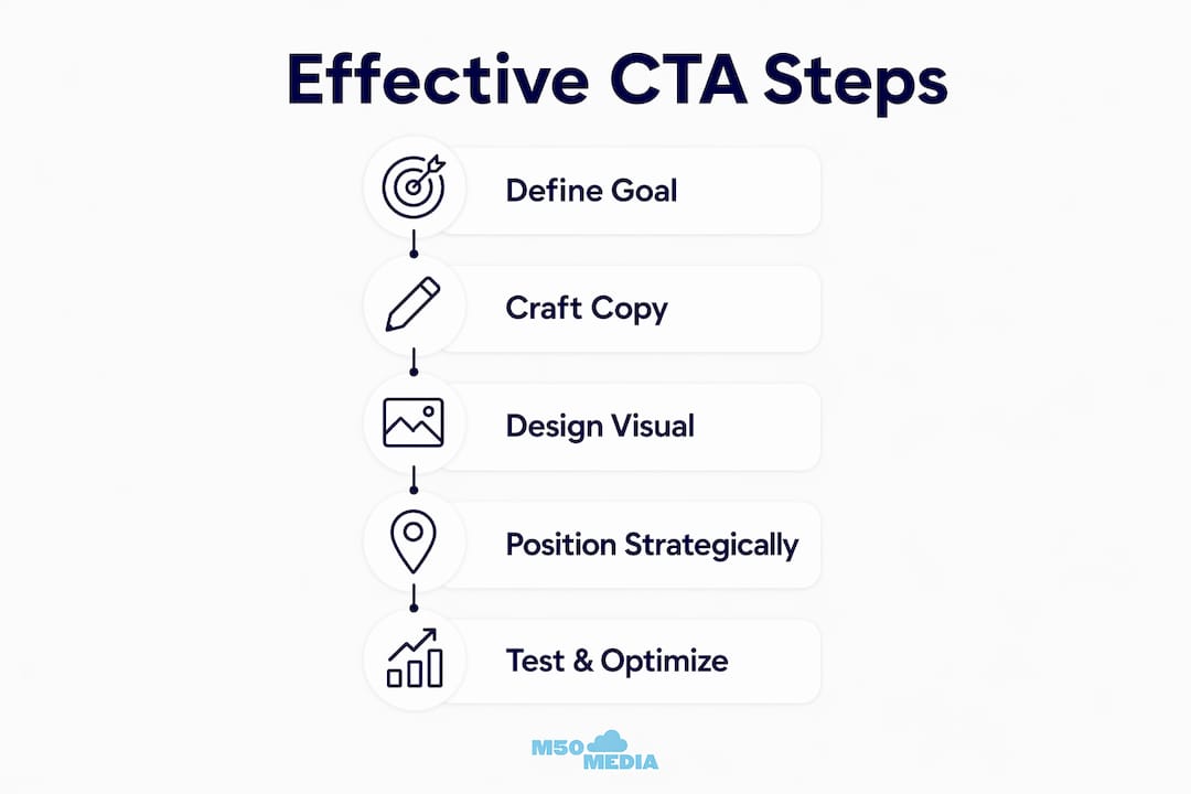
Writing a high-converting CTA is part craft, part science, and part willingness to test things that feel uncomfortable. Here is a practical process that actually works.
Start with the outcome, not the action. Ask yourself: what does the reader get after clicking? Write that as your CTA. “Get My Free Marketing Audit” is better than “Submit.” One is a promise. The other is a chore.
Score your CTA strength before publishing. Rate your CTA on specificity (does it say exactly what happens?), benefit clarity (does it communicate value?), and urgency (does it give a reason to act now?). If it scores low on any of these, rewrite before you publish.
Time your CTAs to capture peak intent. In video advertising, placing the primary CTA in the final 20% of the video captures the highest-intent viewers. In email campaigns, a CTA placed after the key value statement performs better than one dropped in before the reader understands what they are getting. Timing is everything.
Layer in visual support. Pair your CTA button with an arrow, a contrasting colour, and a single line of microcopy. This trio works because it guides the eye, signals importance, and removes the last objection standing between your reader and the click.
Analyse and iterate relentlessly. Use Google Analytics, Hotjar, or your email platform’s click data to track CTA performance. If your click-through rate is under 2% on a landing page, the CTA is not the only suspect, but it is the first place to look. Small copy changes can produce outsized results.
For email-specific CTA guidance, the email marketing tips on the M50media blog go deep on placement and copy within campaigns. Worth a read if email is a core channel for you.
Pro Tip: First-person CTA phrasing triggers mental ownership and significantly increases conversion rates across industries. If you only test one thing this month, make it a first-person vs. second-person CTA split test.
Key takeaways
A CTA’s effectiveness depends on specificity, placement, and copy that speaks directly to what the reader gains, not what they have to do.
Point | Details |
Placement drives conversions | Mid-page CTAs on long-form content convert 220% better than hero-only CTAs. |
First-person copy wins | Switching to “Start My Free Trial” from “Start Your Free Trial” can lift clicks by up to 90%. |
One CTA per page | Multiple equal-priority CTAs cause decision fatigue and reduce overall conversion rates. |
Match CTA to buyer stage | Use micro-conversions for cold audiences and direct benefit CTAs for warm prospects. |
Microcopy removes friction | Lines like “No credit card required” placed near your CTA button address objections before they kill the click. |
Karl’s honest take on CTAs (and why most businesses get them wrong)
I have reviewed hundreds of marketing assets over the years, and the CTA is almost always the last thing people think about and the first thing that tanks their results. Most businesses treat CTAs like a formality. They write “Contact Us” or “Learn More,” slap it on a button, and call it done. Then they wonder why nobody is clicking.
Here is what I have actually observed: the businesses that convert well treat every CTA like a tiny piece of copywriting. They obsess over the word choice, the placement, and the visual context around it. They test first-person versus second-person. They add microcopy. They think about what the reader is feeling at the exact moment the CTA appears.
The other thing I see constantly is CTA overload. Someone builds a landing page with five different CTAs all screaming for attention at equal volume. It is like walking into a store where five salespeople rush you at once. You back out the door. Improper CTA hierarchy creates cognitive overload and reduces conversion success. Pick one goal. Build one CTA. Win.
The emerging formats worth watching are conversational CTAs inside chatbots and interactive content, and in-video CTAs that appear at the exact moment of peak emotional engagement. These are not gimmicks. They are the next evolution of a principle that has always been true: meet your audience where their attention is, and make the next step obvious.
— Karl
Ready to get your CTAs working harder for you?
If reading this made you realise your CTAs could use a serious upgrade (no judgement, we have all been there ), M50media has the tools and expertise to help you fix that fast.
Karl Lundgren works directly with small business owners and marketing professionals to audit, rewrite, and optimise their CTAs as part of a broader digital marketing coaching programme. Whether you are starting from scratch or trying to squeeze more out of campaigns that are almost working, the coaching process is built around your specific goals. Not sure where to start? Book a free Marketing SOS Call and get a clear direction in under an hour. No fluff, no sales pitch. Just practical answers.
FAQ
What is the role of call to action in marketing?
A call to action directs the audience toward a specific next step, converting passive interest into measurable engagement or sales. Without a clear CTA, even well-crafted marketing content fails to produce results.
Why does first-person CTA language perform better?
First-person phrasing like “Start My Free Trial” triggers a sense of mental ownership, making the outcome feel personal and immediate. Research by Michael Aagaard shows this switch can increase click rates by up to 90%.
How many CTAs should a landing page have?
A landing page should have one primary CTA. Multiple competing CTAs create decision fatigue and reduce overall conversion rates, as users become overwhelmed by equal-priority choices.
When should you use a micro-conversion CTA vs. a macro-conversion CTA?
Micro-conversion CTAs (like downloading a guide or watching a video) work best for cold audiences who are not yet ready to commit. Macro-conversion CTAs (like booking a call or purchasing) belong in front of warm prospects who already understand your offer.
What is microcopy and how does it help CTA performance?
Microcopy is the small supporting text placed near a CTA button, such as “No credit card required” or “Cancel anytime.” It addresses the reader’s last objection at the exact moment of decision, reducing hesitation and improving click-through rates.
Recommended
Comments